TUCKER ART 2
|
|
|
|
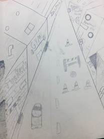
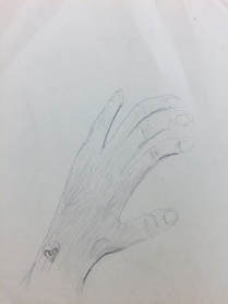
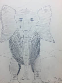
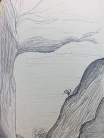
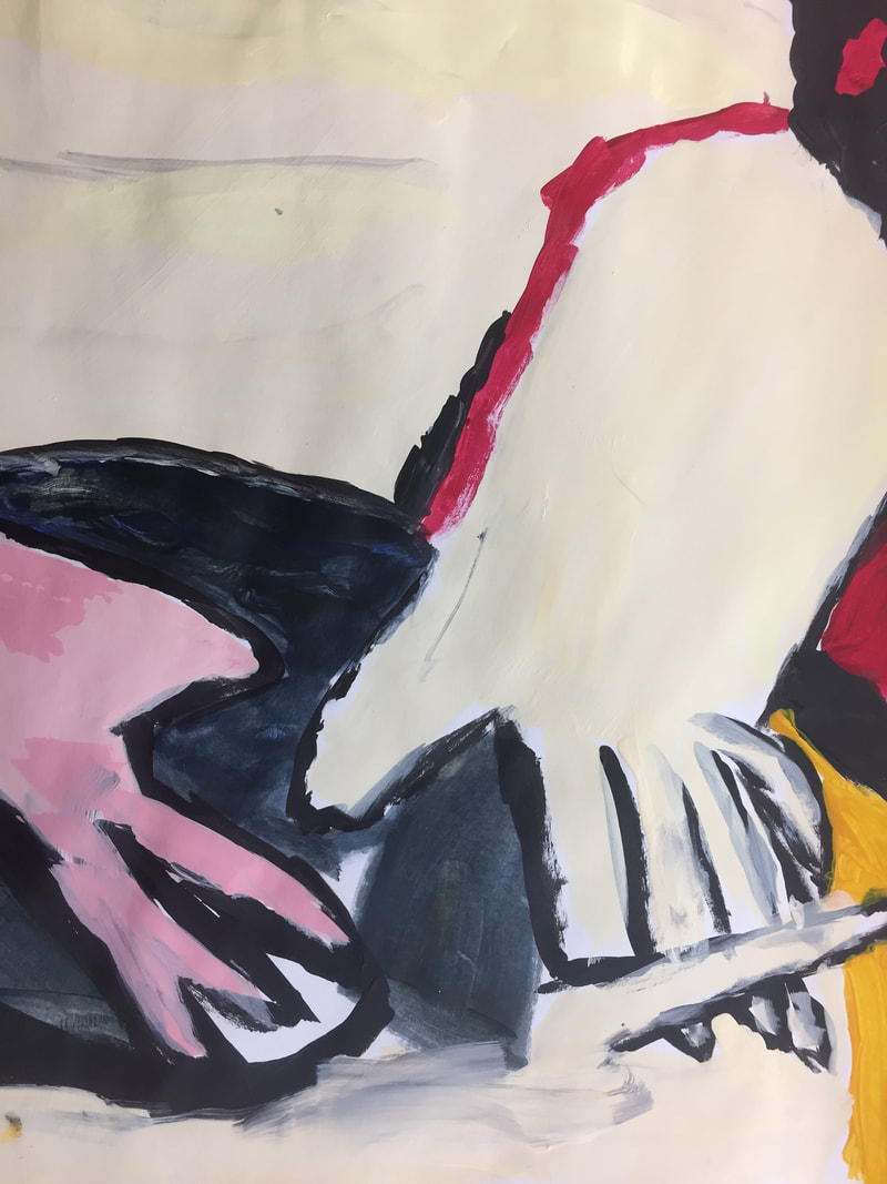
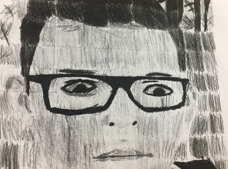
The assessment drawings I drew were very challenging to me because I am not very good at shading and adding value. I also have trouble with proportions and it is evident in my drawings of my hand, city, and elephant. I believe I did a semi decent job with the tree other than the branch. The branch seems a little wonky to me. My texture on the elephants body is just atrocious. But you can still tell it is an elephant. I do like the 1 point perspective drawing I did. I like that style of art because it looks 3D in a sense. For my hand drawing, i think that hands are one of the hardest things to draw and i tried to make it look as if I were drawing my hand in its natural position. i really hope to improve these skills by the end of the semester.
|
|
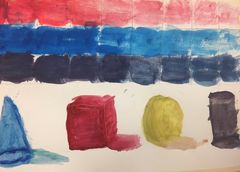
These are my gradient squares, they took some time and energy to do but I think they look pretty cool and they helped me to develop my 100 squares.
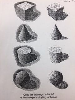
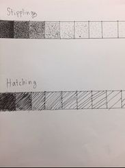
This ifs my stippling worksheet. We had to shade in these 3D shapes with stippling dots. I found this one the most frustrating and time consuming.
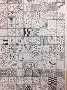
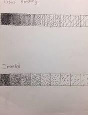
This is my 100 texture pattern squares. I realized through the help of some consultants and my peers that I need to add more darker values to some of my squares because I made most of them light colored. This did take some time and patience as it was 100 different patterns.
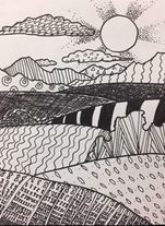
My landscape drawing turned our fairly well. I liked the sun rays the most of this piece because I feel that I faded the rays very well and it looks super cool. I think all the excersizes we did were helpful in creating this.
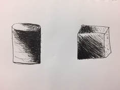
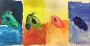
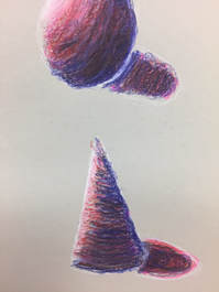
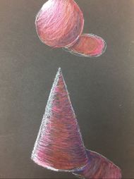
These are my value shapes and I think it was very challenging to show the value wrapping around the shapes because I have never done them before.
|
|
|
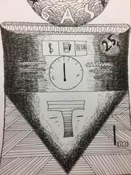
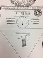
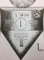
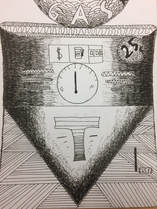
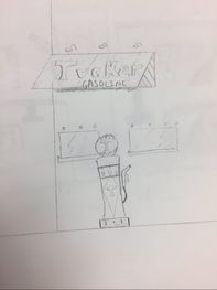
Pen and Ink drawing.
1. I placed the old fashioned gas tank in the very front of the picture so it is the main focus. I used patterns that start out darker and have more value in areas towards the outside of the tank and had it fade out as the design got closer to the middle. This is a successful composition I believe.
2. Texture and pattern are important in this picture because it shows the different areas and shapes in our work.
3. Value is important in this because it brings out a contrast in our patterns.
4. My craftsmanship in this piece shows I put in a lot of work. The final project looks alot better than my original practice worksheets so id say I definitely improved my skills due to the amount of practice we had. My final piece had some of the patterns i worked on the sheets.
5. I believe since we did so much practice with patterns and value it improved my skills and ability to draw with a pen. my technique with a pen got a lot better and i enjoyed doing this project.
6. If you learn the techniques in class it makes the drawing a lot nicer and a lot easier to make. I find the practice helped alot in making these.
7. I think I will learn to prepare and plan a little better because it will make executing the work a more thought out process.
8. I think i would change the angle from where I draw it from and give it a different perspective. I would for sure add a pump because i think that would look really cool on the tank.
Watercolor
|
|
|
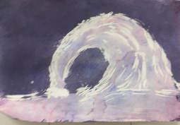
1. We had to draw a picture and use masking fluid to cover the lightest parts of the picture. We then poured water color on the paper and swished it around to cover it up. We then repeated this process till we had our lightest lights and our darkest darks.
2. The difficulties I had with this was not knowing what the final product would be. It could have turned out very poor.
3. I learned how to use masking fluid, add value using water color, different styles of watercolor, along with different techniques to make water color art.
4. I would try a more challenging object. The wave was cool but I think i would wanna do an animal or plant with nore details.
5. We used masking fluid and layers of paint to make these things such as value and texture. we would pour more paint on the darker areas.
6. I feel the other styles of water color were more challenging than just throwing paint on masking fluid.
7. Yes, he showed us his work and gave us a whole new look on water color and painting in general.
8. He taught me that even the most unorthodox techniques can produce a beautiful product and even if your project starts looking bad the final piece can turn out wonderful.
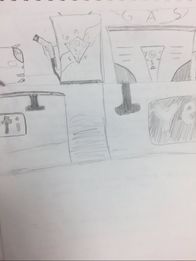
These are my pen and ink sketches in the sketchbook.
|
|
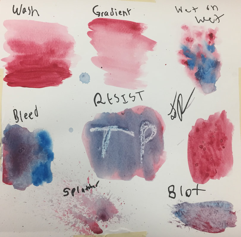
These are my water color practice techniques.
|
|
|
|
This is my research and all my planning and sketches for the clay unit.
|
|
|
|
|
|
|
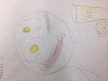
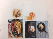
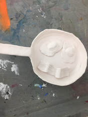
These are my painting practice pieces and my clay before i paint it picture. I think the bacon and eggs look sick by the way.
This is my replication of a piece of art work. There is very little difference in the 2 pieces so try and guess which one is mine.
|
|
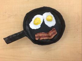
- The craftsmanship in this piece is very neat for my standards. I think I shaped the eggs and bacon perfectly to make them look realistic and it turned out very well.
- The most difficult part of this was making the handle on the pot stay up. But being the master skilled world class artist I am, I was able to succeed and make it work.
- Yes I do believe the colors in this piece work well. Eggs and bacon are a classic breakfast food and I think I got their colors right. Im most proud of the bacon color.
- I think this piece is super sick. Other than the bottom of the pan I would say the piece is interesting on all angles.
- It is different in the sense that you have to make every angle of what your making and not just paint it flat. I do prefer clay over paint though.
- I would use the clay making tools to add textures such as on the bacon and eggs.
- Yes I think this is spot on, I love this piece. It looks so similar to real bacon and eggs in a pan. I really like how it was made.
- I would probably add something more exciting or something else added on. That would make this piece even cooler.
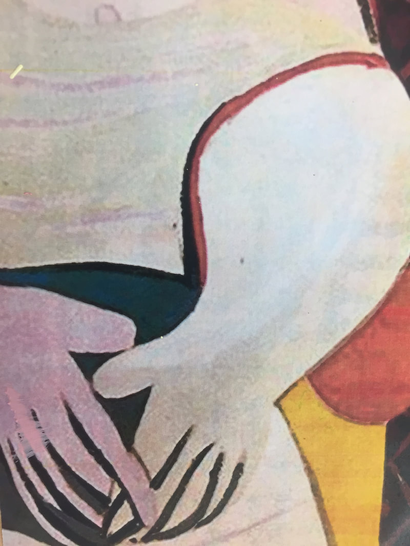
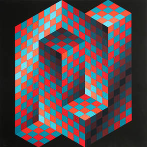
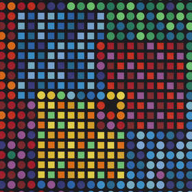
Victor Vasarely
Victor Vasarely was a famous artist who was born in 1906 and died in 1997. He is most famously known for his pieces the had a pattern of shapes with all types of colors and sometimes forming optical illusions. He worked as a graphic designer and based his work on surrealism and abstract expressionism. He was raised in budapest and became a naturalized french citizen to continue his work.
He would use many different shapes and patterns to construct an image the often was a bigger shape. He used very bright colors to create values and texture to his work. A lot of his paintings were similar yet different. They were mostly made of similar shapes and made similar designs and used a lot of the same colors over and over to make great work. His designs were very appealing to the eye and is the reason his work became popular and well known. Creativity flowed through his veins for him to be able to make these pieces. He did not always know he was gonna make art for a living and for 2 years he went to college and studied medicine. He then decided he was going to do commercial art while still making his own projects during his free time.
His paintings he made were very creative and a little abstract. The patterns and colors he used make for a real pleasing view for your eyes and are very interesting to look at. They may seem a little simple and boring when you describe it but if you look at them they are very appealing and cool. It is the type of art you would want to put in your room on the wall. His style is appealing to everyone, even people who do not like art can appreciate his work. You have to be a very creative person to come up with some of the pieces he has done and he has mastered the art of creativity and attention grabbing.
These two pieces are perfect examples of him utilizing his style of creative shapes and bright colors to make a cool optical illusion.
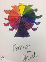
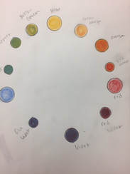
These are my prismacolor practice shapes and color wheel, I hope you like them.
|
|
|
|
|
|
|
|
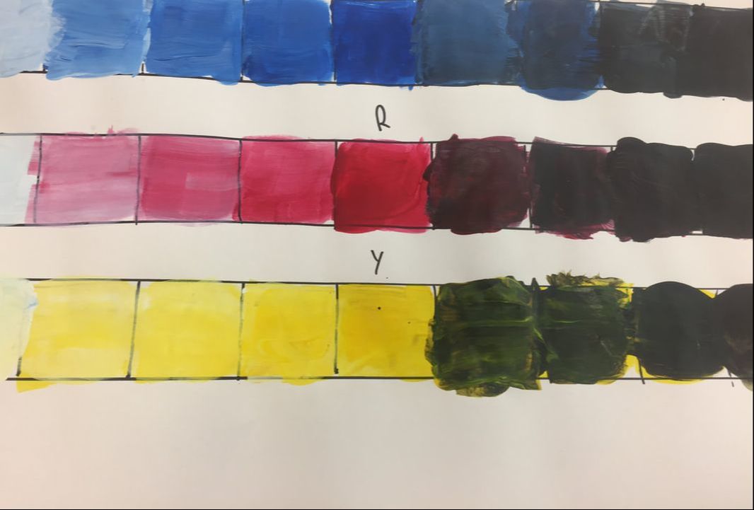
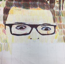
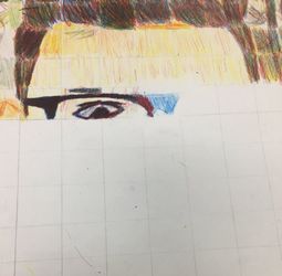
1. The craftsmanship in this piece is is sloppy and scratchy. i found it difficult to mix the colors together and make new colors.
2. I found the whole process of mixing colors with color pencil very hard and near impossible
3. I think I did well going square by square but my abilities to draw made the piece end up not looking great.
4. I did not create value changes with my colored pencils. extremely difficult task.
5. i think my hair looks fairly decent from the colored pencils, that is my favorite part.
6. i could blend the colors alot better to make them really true colors.
7. i dont feel i was prepared, I need a ton more practice with colored pencils.
8. Helen's piece is really good, she mixed her colors very well. ended up very good.
|
|
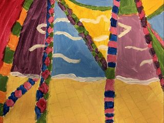
1. Victor Vasarely
- bright colors
-shapes
-patterns
-design
2. I think the craftsmanship is fairly neat and it captures Victor Vasarely's style relatively well. He did not normally paint landscapes but the style comes across in my painting.
3. The most difficult part is making neat strokes with the paint brush to create nice shapes and patterns. I found that to be a bit challenging.
4. I had to use bright and vibrant colors because those are the types of colors my artist utilized most in his work.
5. i made the structures and land made out of patterns and bright colors exactly how i think victor vasarley would have.
6. "How are you even in Art 2."
7. I probably would have added more to the city part of the painting. instead of just a bright yellow.
Final Review
During this semester I have learned how to draw with pen and add texture and value. Learned how to use color pencil primary colors to create all the colors we need. learned how to make things out of clay and paint them to make them look realistic. Finally, we learned how to paint and use concepts made by other artists to develop our own piece. I have to say my favorite piece was the clay eggs and bacon. I enjoyed that unit the most by far and would say I have had the most success with that piece. My least favorite was easily colored pencil. I hated having to try and make all the colors with just 3 colored pencils. I found it frustrating. I however, did enjoy this semester thoroughly and feel I have learned a lot from this course.
